How to Incorporate Color Theory Into Your Retail Store
How humans perceive the world around us influences how we interact with it. We use our senses to understand our surroundings and then make decisions based on the information we gather. With sight being one of our senses, colors and designs can influence many of our decisions. Color theory is the set of principles behind the colors humans can perceive, and it has many applications in art and design.
Do color and design choices matter when it comes to retail stores and visual merchandising? Unequivocally. As a retailer, creating an environment that encourages your customers to stay longer and feel comfortable is essential. One way to achieve this is by incorporating color theory into your store's design. Color theory is a concept that explores the use of color to create visual harmony, balance, and interest. This guide will explore how you can use color theory to create a welcoming and visually pleasing environment for your customers.

Warm Colors Versus Cool Colors
Color theory is split into two categories: warm and cool. Warm colors include red, orange, and yellow and are associated with warmth, energy, and excitement. On the other hand, cool colors, including blue, green, and purple, create a calming and relaxing atmosphere.
Consider using warm colors in your store's entrance and checkout areas to create a welcoming and energetic environment. Using cooler colors in the back of the store can create a relaxing and tranquil atmosphere, encouraging customers to explore more products.
Accents
Using accents is an excellent way to incorporate color into your store's design. Accents refer to small pops of color that complement the store's primary color scheme. For example, if your store has a neutral color scheme, you can use bright yellow or orange accents to draw attention to specific products.
Complementary Colors
Complementary colors are colors that are opposite each other on the color wheel. When used together, they create a dynamic and vibrant look. Examples of complementary colors include blue and orange, red and green, and yellow and purple.
Using complementary colors in your store's design can create a visually appealing environment. For example, if your store has a blue color scheme, you can use orange accents to create a complementary pop of color.
Branding
Color theory can also help you reinforce your store's branding. When choosing your store's color scheme, consider your brand's values, mission, and personality. For example, if your brand is focused on sustainability, consider using earthy tones like green and brown. Using your brand's color scheme throughout your store's design can create a cohesive and memorable shopping experience for your customers.
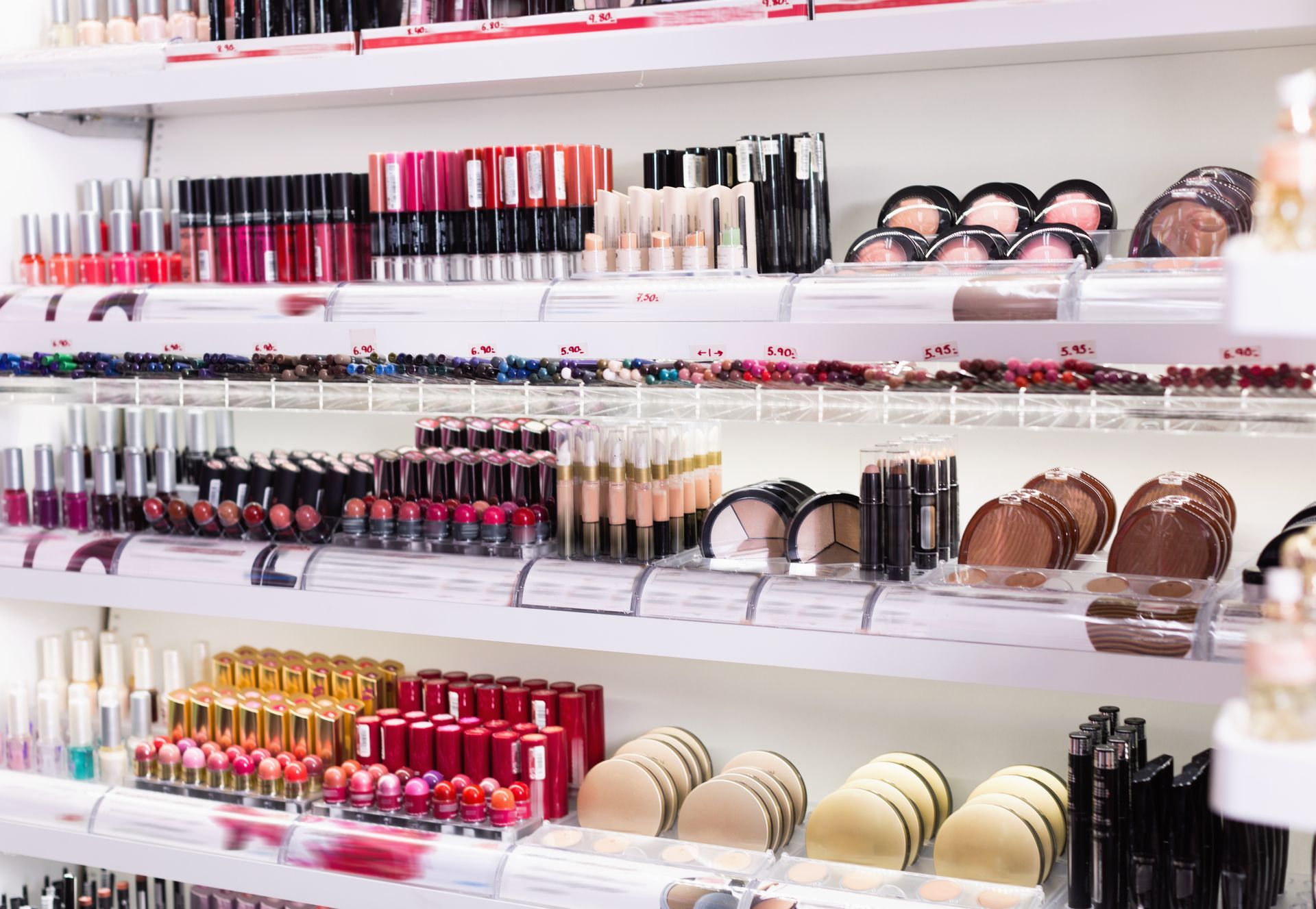
Retail Displays
Retail displays play an essential role in creating a visually appealing store. When designing your store's displays, consider the colors you're using. Avoid using too many colors in one display, as it can create a cluttered and confusing look.
Instead, stick to a maximum of three colors per display. You can also use color to highlight specific products or create a focal point in your display. For example, if you're displaying a new product, consider using a bright color to draw attention to it.

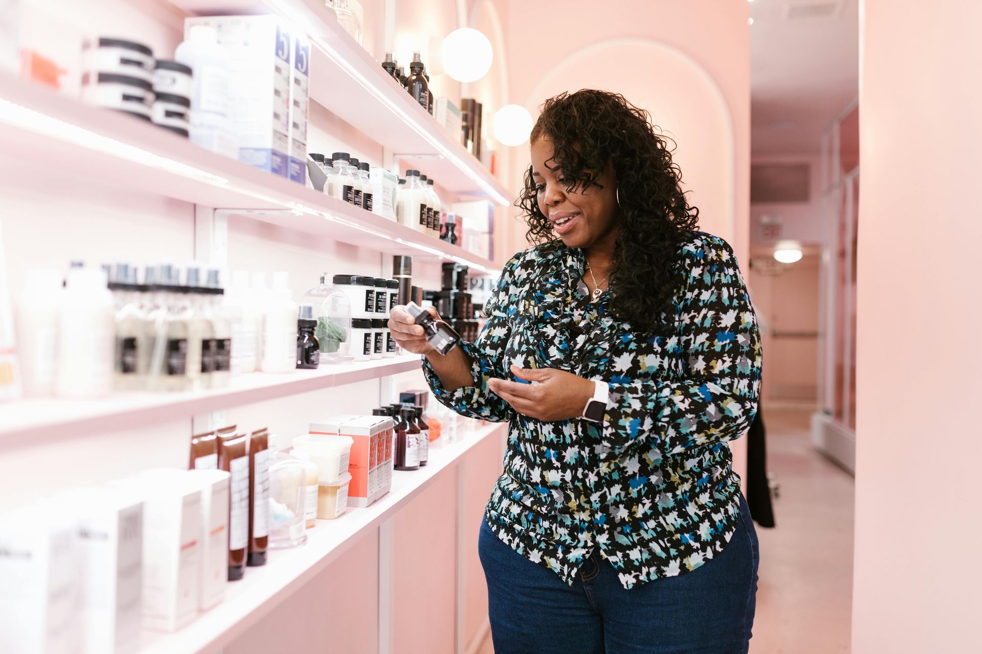
Natural Versus Artificial Light
Lighting is another critical factor when incorporating color theory into your store's design. Natural light can bring out the natural colors of your products and create a warm and inviting atmosphere. If your store has large windows, consider positioning displays near them to take advantage of the natural light.
Artificial light can also be used to highlight specific colors or products. Consider using warm white lighting to create a welcoming atmosphere or cool white lighting to create a modern and chic environment.
Merchandise
Finally, consider your merchandise when incorporating color theory into your store's design. Your products' colors can complement or clash with your store's color scheme, so it's essential to consider them when designing your store.
For example, if you're selling brightly colored products, consider using a neutral color scheme in your store's design. This can create a cohesive and balanced look. Alternatively, if your products are neutral, consider using bright pops of color in your store's design to create visual interest.
Work With Exactec
Our Exactec team is well-versed in visual merchandising strategy and creating unique displays to help your store stand out. We have decades of experience creating custom displays from acrylic, plastics, and more.
Contact us today if you're ready to create memorable in-store experiences for your customers!